My Top 8 Photos (That I wasn't suppose to do so it's really 4)
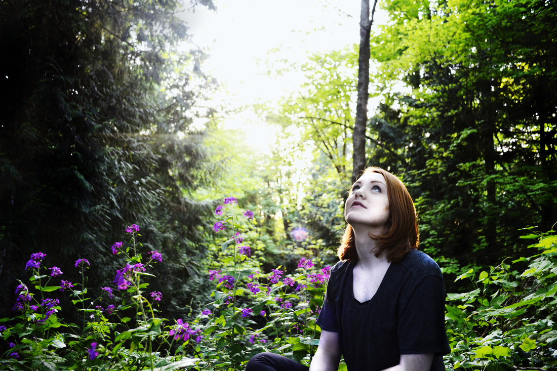
This photo is one of my favourites. Manjot and I chose to edit it differently and put both versions in our presentation; however, this is the version that I edited. I like for this photo, I really liked the way this photo looked with brighter colours and cooler tones. Manjot's photo had warmer tones and looked more natural. I really like how Emma and the flowers stand out since they're the only real colours aside from green in the photo. I also think this a very balanced photo and I really like the composition of it. When I was editing the photo I tried really hard to fix the blown out sky in the background. I personally think that it does't take away from the photo but I wanted to tone it down a little. I didn't have too much success so I just left it. Overall this is one of my favourite photos.
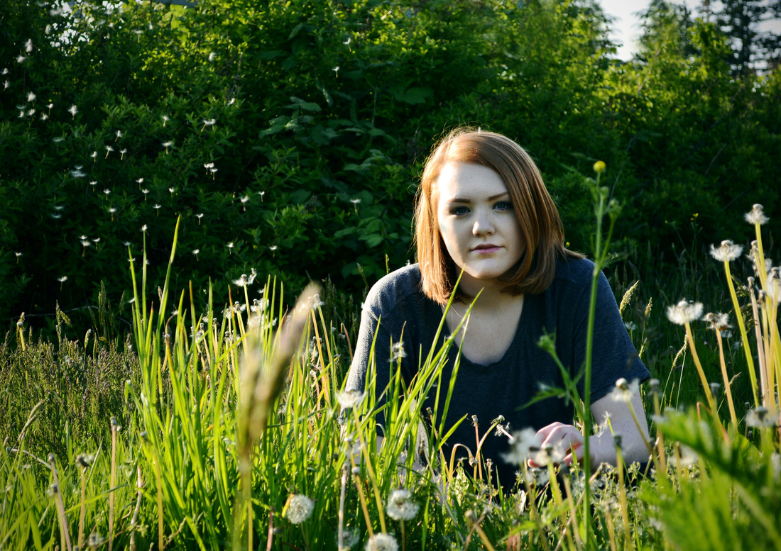
This photo was also a part of the Soundtrack of My life project. This photo makes me laugh every time I see it because I keep picturing myself blowing the dandelion fluffs out of the shot. The process for taking this photo showed me that a lot of preparation and "background" work that goes into taking a photo. I could not take it seriously when we were doing this shoot. I kept laughing every time I had blow and fan the fluff things into the shot. But despite all of that, I think the photo turned out really good. I like the use of depth of field in this photo. Normally I prefer photos with a shallow depth of field, but I like that this one is different and some of the foreground is not in focus. I also used the clone stamp tool in the editing of this photo because you could see the power towers in the background and I thought that it took away from the "natural environment" feel of the photo. I really like this photo because it really goes well with the rest of the photos from this project.
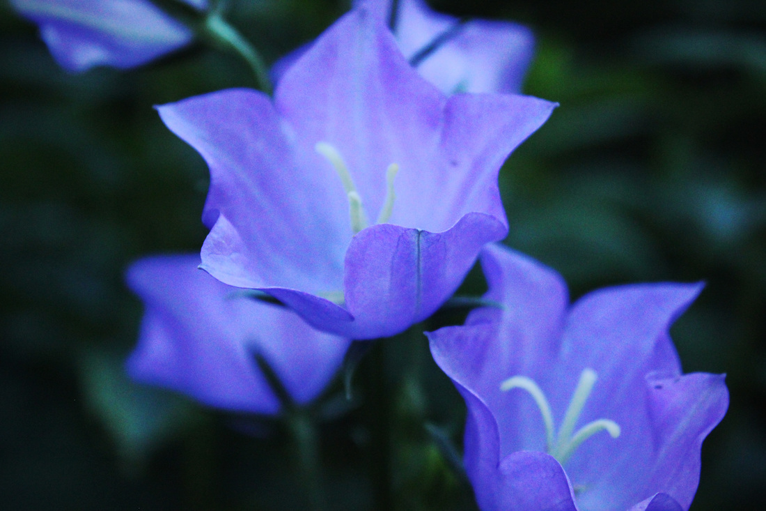
This photo was a part of my set 6 photo of the week. For all of the photo of the week's I took a lot of flower shots . I think that my set 6 flower shots were different from a lot of my others because the tones were darker. I also like that this photo has some noise to it. I personally think the noise doesn't detract from the photo and adds to it because it goes well with the darkness of the photo. I also like how there are minimal colours in the photo. It's primarily blue, purple and green. I think that because there are less colours it compliments the photo since it's less busy. I also like how there is one that's really in focus and few others that are a part of the background.