Photo of the Week
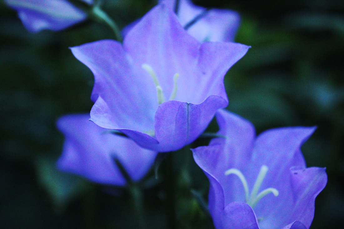
Photo of the Week Set 6
This was one of my set 6 photo of the weeks. I was taking shots of flowers but this time I tried focusing taking photos with darker undertones. I really like this photo because it primarily has only blue, green and purple tones to it. I also like that it has some noise to it because I think the grain adds to this photo.
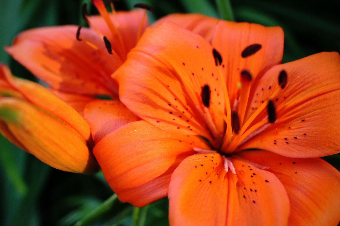
Photo of the Week Set 5
For the photo of the week set 5 I wanted to focus more on brighter colours and tones in my photos. I really like this one because it's this very bright orange over a more muted green background which I think makes the flower stand out even more. I wanted to really zoom this photo in and try and capture the flower antennas (don't know what they're actually called).
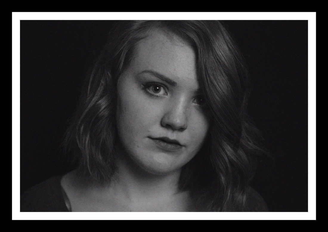
Photo of the Week Set 4
This photo of the week I did portraits. This one I felt looked better in black and white and I added noise to it to give a more grainy and texture-ish tone. I really liked how this photo turned out in black and white because lots of times they look awful once they've been changed from colour to black and white.
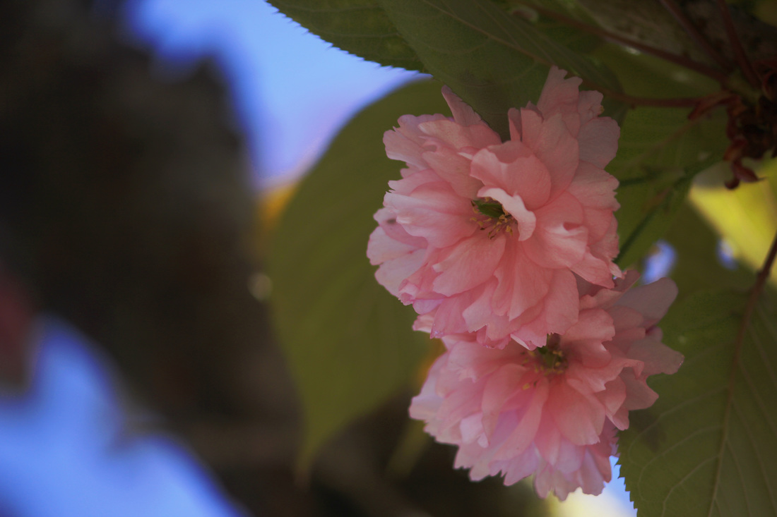
Photo of the Week Set 3
I took photos of cherry blossoms for this set. I really liked this one because there are only two cherry blossoms in the photo instead of like 20. I think that it makes them stand out a little more and shows that they're the main focus of the photo.
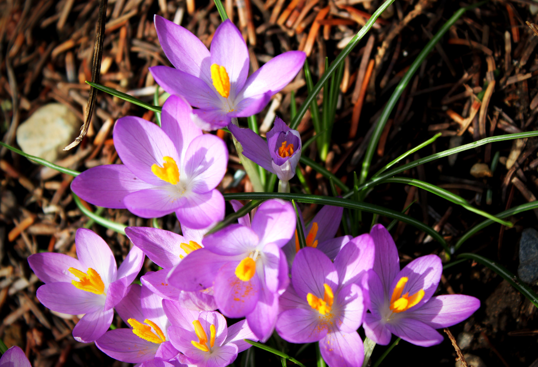
Photo of the Week Set 2
This photo I really like because of the bright colours and how the flowers really stand out. These were some of the first flowers that bloomed in spring, which was my topic for my photo of the week challenge. I think it really captures spring since you can see that some of the flowers are fully bloomed and some are partially or just beginning to bloom.